3.16.2009

Lie Factor: Dear Gizmodo, Popcorn isn't THAT expensive

Recently, I stumbled on an article over at Gizmodo about the exorbitant price of popcorn. To sum up the article in a couple of bullet points:
• A movie ticket in 1929 was $4.32. A ticket in 2009 is $7.20 - A price increase of 66%
• Popcorn in 1929 was $0.62. Popcorn in 2009 is $4.75 - A price increase of 666%

Below is the graphic created to represent the data:
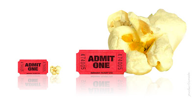
It's a fun and flashy graphic that shows cost increases in popcorn and ticket prices. Unfortunately, from an information visualization perspective it is awful. In fact, the image is a good example of how graphics can be (un)intentionally misleading and manipulative.

First, how does the graphic represent the data? The increase in cost between the 1929 and 2009 images is shown by an increase in the height of the ticket and popcorn images. The problem is that if Gizmodo was going to demonstrate the information in this way, they should not have scaled the images proportionally. Why? While we are primed to accentuate the vertical dimension of the image, the truth is that the area of the image plays a large role in how we digest the information.

Edward Tufte says this about visualizing information:
The representation of the numbers, as physically measured on the graphic itself, should be directly proportional to the quantities represented.

So how badly does Gizmodo violate this rule? I decided to extract each image from the graphic and measure the area. To be fair, I removed the images with the equivalent of a square cookie-cutter, so my calculations might be slightly exaggerated... but I think you'll get the point.

Instead of a 66% cost increase for movie tickets, the graphic shows us a 166% increase for movie tickets.
Instead of a 666% cost increase for popcorn, the graphic shows us a 4500% increase for popcorn.


That is awful. And whether it was intended or not, the graphic is deceptive. Another way we can measure this is looking at the lie factor - the proportion of the data compared to the proportion of the visualization. A truthful visualization has a lie factor of 1. Generally, somewhere between 0.8 and 1.2 is considered tolerable.

The movie ticket graphics have a lie factor of 2.5.
The popcorn graphics have a lie factor of 6.75.

Ouch. To preserve the truthfulness of the graphic, I tweaked the visualization to be more like a bar graph (which preserves the data):
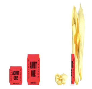
Looks a little bit different, doesn't it? The contrast between the two popcorn graphics doesn't look quite as extreme anymore. The point is still made, but this time with a kernel of truth.

Unfortunately, there is another problem with the graphic - it fails to tell the story. The whole point of the article is that the cost of popcorn has increased dramatically more than the cost of a movie ticket. The graphic is comparing the price of popcorn and a movie ticket in 1929 vs. the cost of popcorn and a movie ticket in 2009. Instead, it should be comparing the cost increase of a movie ticket vs. popcorn. I created one more simple bar graph to show this relationship:
Wow. For me, this visualization is the most stunning of all. It is simple and uncluttered - yes - but more than that, it drives home the point in convincing fashion. The point is that we don't need flashy graphics to tell a good story. To be clear, I'm not opposed to using images as long as they preserve the data. In fact, contrary to some visualization experts, I think we make a deeper connection with the data when it has aesthetic appeal. But the takeaway is this: Good data and good relationships tell a good story all by themselves.
.

3.13.2009

InfoStream Visualizations: Goals and Priorities

(Note: If you haven't read my previous post: I Need You: Twitter, Information Overload, and Work Flow, you might want to give it a quick run through before you continue.)

After laying out the foundations of my project in the last post, I've been doing quite a bit of reading, questioning, and researching. Now it's time to lay out some goals and priorities to help constrain design process.

Overarching Design Goals:
1) Create visualizations of twitter streams (and more broadly, social network streams) that represent multiple layers of detail and abstraction.
Why? To prevent information overload and interruption. High level views should be "glance-able" - I should be able to get a general understanding of what is going on in the network through just a quick glance of the application.

2) Design these levels to smoothly transition from one to another. It should feel like a continuous transition instead of discrete, blocky states.
Why? The view will constantly be adjusting to your current state of focus, trying to limit distraction. The transitions themselves should not be distracting.


What is Important?
The difficult part in trying to create a birds-eye view is that we have to determine What is most important? What should we preserve at different levels? What best represents the community as a whole? Here is a list of priorities I have come up with for Twitter.

Replies/Direct Messages: This is seems pretty obvious, but I am going to be most interested in messages that are directly intended for me. They should be given a very high priority.. and most of their content should be preserved.
Community Value: Which messages are RT the most? Tweets that are considered most valuable to the community are often shared the most.
Community Trends: This is often demonstrated by "trending topics" on the Twitter search page. I'm sure that this largely corresponds to which messages are being RT the most, but I'm not ready to combine them just yet.
Locale: Messages that happen geographically close to me may be more interesting than those that occur 2,000 miles away. They open up the opportunity for meetings or events I'm interested in.
External Links: A lot of the content happens outside of the Twittersphere - blogs, news articles, YouTube videos. This shouldn't be completely lost in a representation of the community.
Interest Based Messages: This is a little tricky because I can't make a sweeping generalization about what a person's interests may be. For me, I always like reading about HCI, Boston, and the Bills. But the fact that my next door neighbor doesn't like the Bills shouldn't mitigate Terrel Owens newfound presence in my Twitter stream (For better or for worse).

A lot of thanks to @JesseNewhart 's YouTube video titled "How to Follow 15000+ People on Twitter Using these TweetDeck Tips". It helped me understand the process of someone who is forced to process an enormous Twitter stream.

Challenges:
Sweeping generalizations are dangerous: Representing a stream in a high-level visualization means that I have to do some generalizing. Unfortunately, this also means making decisions for people about what I think should be most important to them. I'm not sure this is healthy or helpful. Either a filtering or priority system should probably be included in the final design.

Transitioning from an overview to individual messages is difficult: I can imagine several visualization techniques that give beautiful overviews of some of the information listed in the previous section. I can even imagine the ability to zoom in and out of them to create multiple layers of detail. However, the difficulty comes in representing the deepest layer of detail: each individual tweet. How do I smoothly transition from a visualization to an individual message?

Your Input is Needed!
Get used to seeing a message like this at the conclusion of all my posts for this project. But it's true! I am trying to design visualizations for the Twitter community. Instead of trying to guess what you think and need, I'm asking you. Comment, send me a Twitter message, or send me an email (evanpeck [at] gmail.com). I want to hear from you.
.

3.10.2009

I Need You: Twitter, Information Overload, and Work Flow.

Hello everyone!

I am beginning a research project to help moderate workflow and interruptions from services like Facebook, Twitter, Flickr, Digg, etc.

I need your help.

Most of you who have spread themselves across the larger social media world now seem to be gravitating towards clients that can gather your scattered piles of information and communication into one cohesive place. Instead of simply using TweetDeck, you might use an application that combines Facebook statuses, Twitter messages, email alerts, and more all in one. It makes sense.

Unfortunately, our social networks are getting too big. I recently downloaded AlertThingy and received a new alert every 2 seconds or so (And I am by no means a power Twitter user). This typically results in information overload. So that is one problem. The other problem is that applications like TweetDeck and AlertThingy are often background tools. They are usually not my main focus. Instead, I am trying to write a paper, or research visualization techniques, or have a conversation with a friend in the Midwest.


The conversations on Twitter can be distracting - the ultimate nemesis of productivity. Even worse, I may be chanelling all the RSS feeds of my favorite blogs, news sites, and social bookmarking outlets into the same funnell. But at the same time, I still value them. I still want to know what's going on. I still want to be nudged if something exciting happens. How can anyone get anything done?

Let's get to the main questions: What if I can visualize this information stream at multiple layers of abstraction? Think about Google Maps, where I can view the map at 2,000 feet up and get a general sense of the topology or I can zoom down to see the parked in driveway. What if we could do this with Twitter? If we can, it means that when I glance over at Twitter during a writing spree for a 10 page paper, I can quickly see whether something in the massive stream of information is interesting to me. Just at a glance. I don't have to read through the 25 messages on the screen (even if I did, I might have missed something important in the 26th message). It still might be a distraction... but a .5 second distraction is better than a 20 second distraction.. especially since those 20 second distractions often end up in endless spirals of links and chatter. No need to always tumble down the rabbit hole.

I need you.

And here is where I need you. I follow around 200 people on Twitter. It is a fair amount... but no where near the thousands or tens of thousands of users that others follow. Now, I know that you are not reading every message from every person in your TweetDeck screen. Whether you are doing it explicitly or not, you are filtering and prioritizing information. Maybe you look for certain avatars that represent certain people. Maybe you look for key words. Maybe you give priority to people who are located somewhere around you. Maybe you pay special attention to words that are currently trending in the Twitter world. Or maybe you start paying attention if someone starts tweeting more than usual.


I need to know what you look for when you glance through Twitter messages. That way, as I look to design different levels of visualization, I will be carving out topologies and not counting garden gnomes. You have valuable insights and opinions. Maybe you've even secretly thought of this sort of thing and have some ideas of what is should look like. Well, tell me.

After all, if I want to do things right, I might as well ask the people who really know about it.

Where is this going?- Future Implications

While the idea of visualizing Twitter at multiple levels of abstraction is interesting enough to me, I skimmed over one important question - How can an application know which level of visualization to use? That's where the foundations of my research group come in.

Right now, we are researching Brain-Computer Interfaces. The whole project reaches out into the future a bit, but one measurement we have been working on is mental workload. So depending on how much mental processing you are using on that term paper, we may be able to adjust the visualization of your information stream accordingly. Anyways, I won't go into too much detail, but if you want to know more, you can always go here and read about some of our work.

Another potential application comes from mobile devices. Higher level views of information will preserve screen real estate. It makes sense to use these sorts visualizations on the iPhone (or whatever your device of choice is). Get a lot of information quickly and in a small space. You might not get everything, but you can always choose to dive deeper.

So tell me what you think. Post your thoughts in the comments section, send me a tweet (@EvanMPeck) or even shoot me an email (evanpeck [AT] gmail.com). I'd love to hear your opinions.

Cheers!
Evan
.

3.02.2009

How to Get People to Use Twitter During Your Presentation

1. Deliver a strong presentation. 

(end post)
.

2.23.2009

Why No One Wants to Start Using Twitter

I'm currently reading a paper in which Jennifer Preece, a professor in the Information Systems Department at the University of Maryland, outlines three components of sociability to support social interaction online:

Purpose
People
Policies

Since my life has been intertwined in what is now an eight month experiment with Twitter, I can't help but putting the community into the scope of these terms. I think it helps explain why Twitter is unpopular to start using. The basic communicated purpose of Twitter is very weak.

Watch this brief introduction video to Twitter:


What do you get out of that? Twitter is for telling people I'm going to get a gallon of milk. Twitter is for telling people I'm going out for coffee. Twitter is for telling people I'm watching a movie. So Twitter is just for status messages? The profiles are weak, the ability to find your friends is weak, and the communication is constrained and limited. So basically, it's Facebook without everything that is interesting. It's no wonder that the majority of people view Twitter along these lines:


So what is it that actually makes Twitter interesting? Why do people prefer it over Facebook or MySpace? A second paper by Preece may help shed some light. She says that "defining the community's purpose is important so that potential participants can immediately find out about the communities goals."

What's the problem with Twitter?- The purpose and goals of the community are wildly different from the purpose and goals defined by the basic definition of Twitter.

Here is what makes Twitter interesting for me:
  • Professional contacts.
  • A living, breathing, always-active recommendation system - whether that means a restaurant in Boston, the best shoes to buy, or interesting blog to read.
  • Group discussion and dialogue about trending events.
  • The ability to mobilize for social justice, local charities, or even just personal help.
  • The ability to draw like-minded (and not so like-minded) people together in the real world for real events.
  • For spreading news fast, accurately, and with multiple perspectives.
  • Viewing the personal face of corporations and businesses (@pandora_radio, @comcastcares, etc.)
I don't think my list is anywhere near unique, but not a single one of those reasons are on the Twitter website (that I know of). I had to slowly and gradually learn each and every one. To be honest, I never would have started using Twitter if it wasn't for an off-the-cuff decision to attend Social Media Camp Boston on an uneventful summer afternoon.

I'm never going to join a community where its purpose is to let people know I'm buying a gallon of milk down at Shaws. Maybe Twitter ought to stop pitching it that way.
.